Sponsored ads:
Candlestick Charts
A candlestick chart is a style of bar-chart used primarily to describe price movements of a security, derivative, or currency over time.
It is a combination of a line-chart and a bar-chart, in that each bar represents the range of price movement over a given time interval. It is most often used in technical analysis of equity and currency price patterns. They appear superficially similar to error bars, but are unrelated.
Sponsored ads:
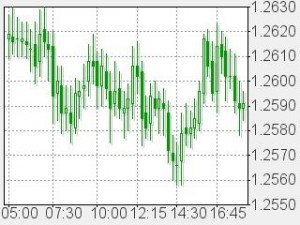
Candlestick chart of EURUSD
Sponsored ads:
Candlestick chart topics
 The basic candlestick
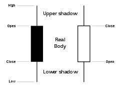
Candlesticks are usually composed of the body (black or white), and an upper and a lower shadow (wick): the area between the open and the close is called the real body, price excursions above and below the real body are called shadows. The wick illustrates the highest and lowest traded prices of a security during the time interval represented. The body illustrates the opening and closing trades. If the security closed higher than it opened, the body is white or unfilled, with the opening price at the bottom of the body and the closing price at the top. If the security closed lower than it opened, the body is black, with the opening price at the top and the closing price at the bottom. A candlestick need not have either a body or a wick.
To better highlight price movements, modern candlestick charts (especially those displayed digitally) often replace the black or white of the candlestick body with colors such as red (for a lower closing) and blue or green (for a higher closing).
Candlestick patterns
In addition to the rather simple patterns depicted in the section above, there are more complex and difficult patterns which have been identified since the charting method’s inception. Complex patterns can be colored or highlighted for better visualization.
Candlestick charts also convey more information than other forms of charts, such as Open-high-low-close charts. Just as with bar charts, they display the absolute values of the open, high, low, and closing price for a given period. But they also show how those prices are relative to the prior periods’ prices, so one can tell by looking at one bar if the price action is higher or lower than the prior one. They are also visually easier to look at, and can be coloured for even better definition. Rather than using the open-high-low-close for a given time period (for example, 5 minute, 1 hour, 1 day, 1 month), candlesticks can also be constructed using the open-high-low-close of a specified volume range (for example, 1,000; 100,000; 1 million shares per candlestick).
Use of candlestick charts
Candlestick charts are a visual aid for decision making in stock, foreign exchange, commodity, and option trading. For example, when the bar is white and high relative to other time periods, it means buyers are very bullish. The opposite is true for a black bar.
Heikin Ashi candlesticks
Heikin-Ashi (Japanese for ‘average bar’) candlesticks are a weighted version of candlesticks calculated with the following formula:
- Open = (open of previous bar+close of previous bar)/2
- Close = (open+high+low+close)/4
- High = maximum of high, open, or close (whichever is highest)
- Low = minimum of low, open, or close (whichever is lowest)
Heikin-Ashi candlesticks must be used with caution with regards to the price as the body doesn’t necessarily sync up with the actual open/close. Unlike with regular candlesticks, a long wick shows more strength, whereas the same period on a standard chart might show a long body with little or no wick. Depending on the software or user preference, Heikin-Ashi may be used to chart the price (instead of line, bar, or candlestick), as an indicator overlaid on a regular chart, or as an indicator plotted on a separate window.
Continue to next lesson
Sponsored ads:

